Desai Accelerator | Summer 2022
Role: UX/UI Designer
Team: Brendan Hart - Founder and Developer
Kelly Liu - UI/UX Designer
Sarah Whitman (me) - UI/UX Designer
Timeline: 3 weeks
Skills & Tools: Figma, Miro, Whiteboarding, Wireframes, Mid-Fidelity Prototype, Iterative Design Process, User Interface Design, Mobile Design, Ionic Design System
Infinite Degrees, now idX, is a ski and snowboard video-based platform to allow action sports athletes to learn, post, and connect with other snow lovers.

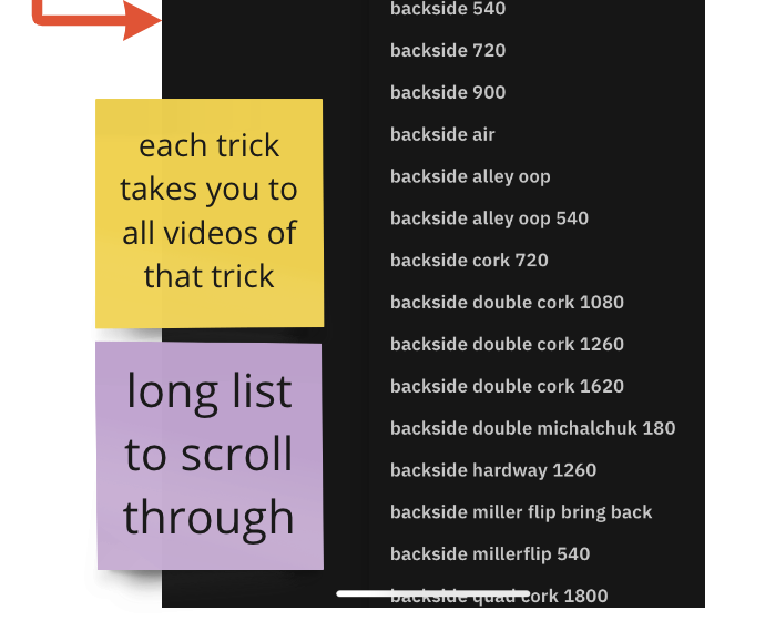
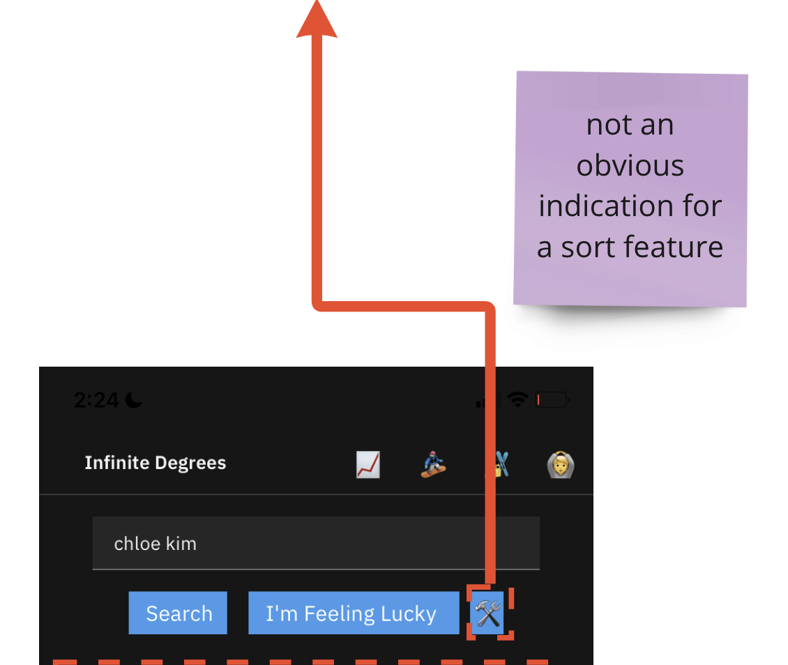
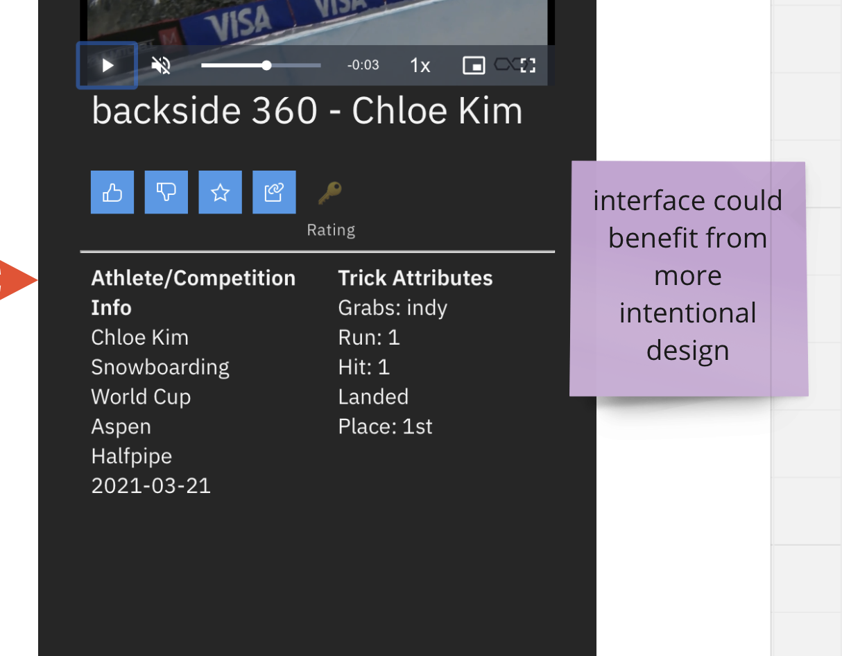
The challenge of the established interface was that it lacked an organizational system in order for users to navigate through the large database of videos. With the primary focus from the development side being the database integration, UX and design ideas were kept minimal. Both existing and new users struggled to browse and understand how to find what they were looking for. With a startup app, in order to get over the curve and gain committed users, people should feel the app is intuitive, which was not currently being felt at this point in time.
The platform does have both a web and mobile version, but our team was tasked with redesigning the mobile app interface to a medium-fidelity prototype level with the goal of being used to:
- Guide future front-end development of the app
- Serve as a baseline demo to use with potential investors and partners
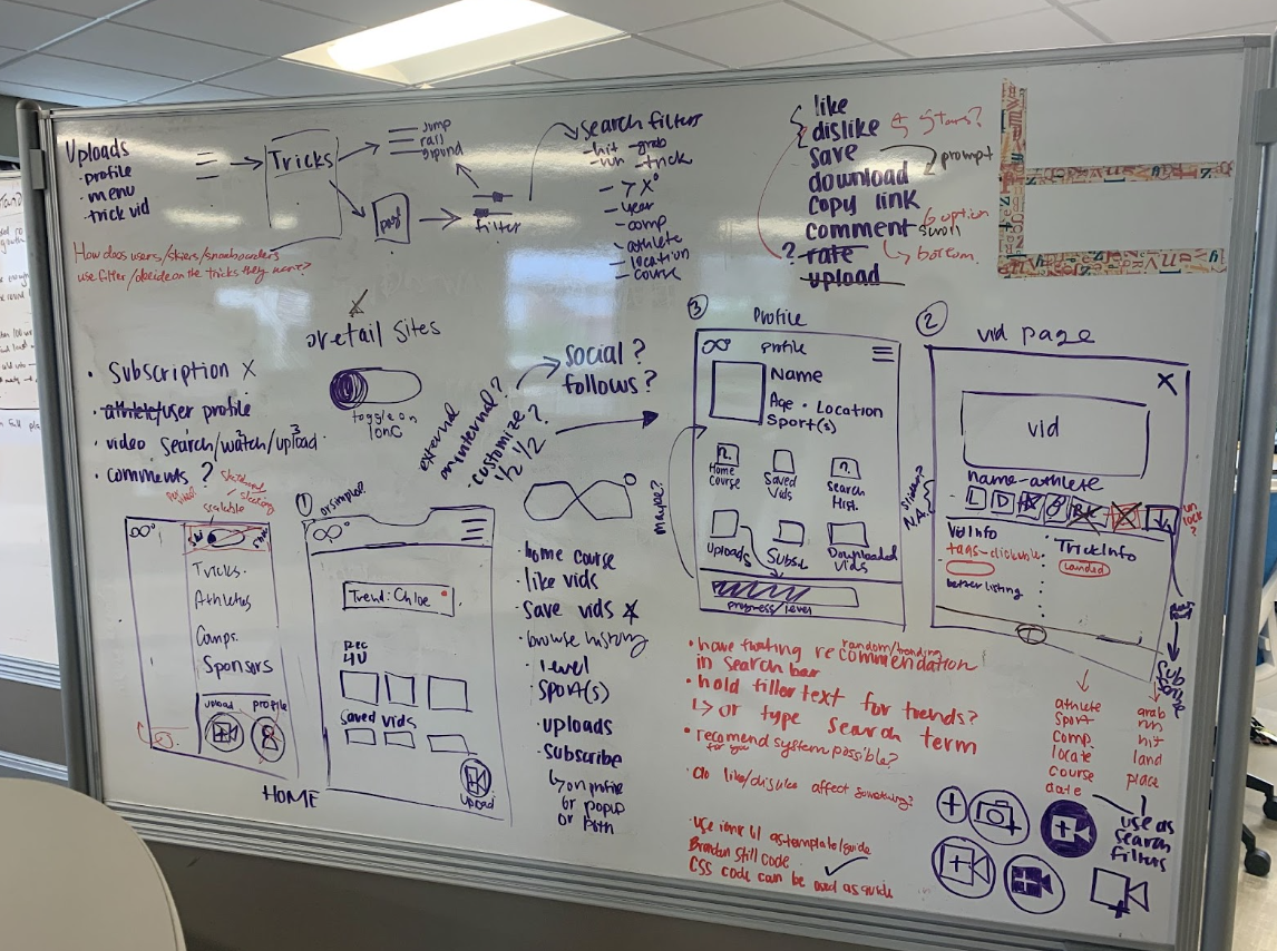
To have a better grasp on the current user flow, we created an interaction map, using Miro, documenting the possible pathways any user could take on the app. By creating this map, we were able to see flows that make sense, but also interactions that could be improved upon. We added any potential pain points as sticky notes on our Miro board.
As a design team, we had several whiteboard sessions to get all of our thoughts down. We had iterations upon our own thoughts, and had other designers and colleagues around us give input as well. We were focused on a few main goals throughout our brainstorming:
- Creating a more specific classification system to sort and filter the videos
- Implementing a more standard navigation bar
- Adding more actions to a video page
After several sessions, we narrowed down the main categories that would be needed on the app as well as the main navigation bar that was the most logical for the new iOS design.
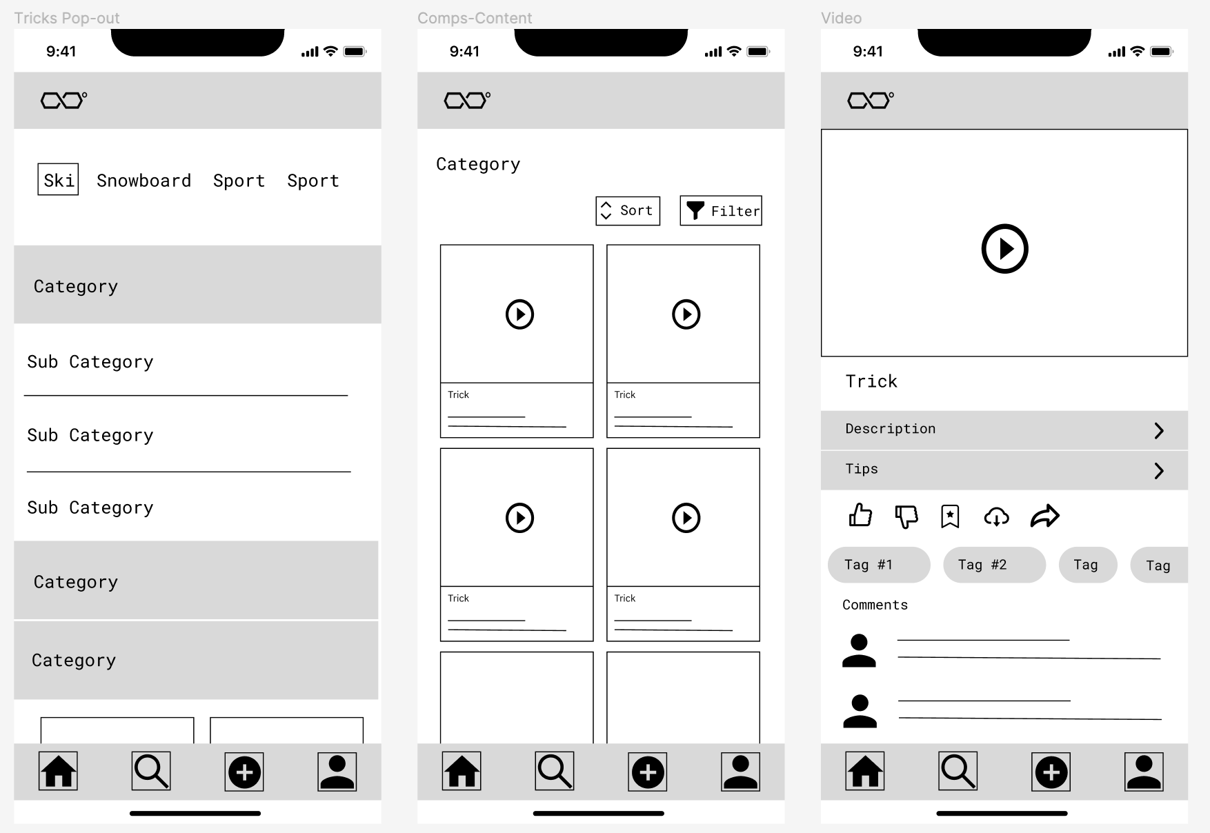
Next, we went into Figma to create some wireframes as outlines for our design. We wanted to include this step because we were changing a large part of the user flow, and wanted to make sure we understood what key screens would look like as wireframes, before further designing.
This project was not being implemented to a high-fidelity level, as it was being used to aid technical development. We utilized the Ionic Design System as a guideline, as that is the framework Brendan planned to use for certain UI elements such as buttons, chip tags, and checkboxes. We created all the screens based on our newly established user flow and wireframes and created an interactive mid-fidelity prototype using Figma.
We suggested in our design to invert the overall feel of the original app design, by going from “dark mode” to a lighter white and grey palette with highlights of purple. By expanding to a 4-tier filtering system, our prototype was designed for users to more easily sort through the large database of videos.
.gif)
Infinite Degrees is an early stage startup with a sole founder and few users, so unfortunately we did not have access to much user data. What we utilized was other members of our startup community, and collaborated with 4 other startups and our colleagues to get regular input on our progress.