Role: UX/UI Designer
Team: Sarah Whitman (me) - Design Lead
Hannah Triester - Research Lead
Tiffany Guo - Evaluation Lead
Jacob Negroni - Project Manager
Timeline: 7 months (September 2022 - April 2023)
Skills & Tools: Figma, Miro, User Research, Focus Groups, Personas, Heuristic Evaluation, Iterative Design Process, User Interface Design, Desktop and Mobile Design

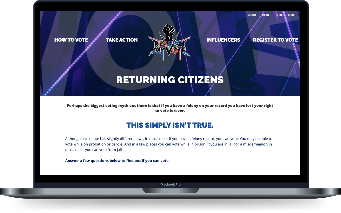
Hip Hop Caucus is a non-profit non-partisan organization focused on organizing those who identify with hip hop culture and share values of justice and equity. They create platforms for grassroots leaders and collaborate with artists, celebrities, the media, and have a presence in bodies such as Congress and the United Nations. The focus on strengthening democracy, climate change with environmental justice, civil & human rights, and economic justice. The Returning Citizens Tool is part of HHC's larger Respect My Vote campaign. Since first launching Respect My Vote in 2008 HHC has worked with Hip Hop artists to register and educate tens of thousands of voters and help them get to the polls, reaching tens of millions of voters with information about voting. The RC tool is a free resource for people with a felony record to check their eligibility to vote based on state legislation. It helps in registering, educating, and mobilizing voters, specifically ex-felons/convicts, thereby strengthening our democracy via accurate and digestible information. Supporting the organization’s ultimate intent to increase the voting population across the country, the tool has been used over 100,000 times since its launch in Fall 2021.
The current tool is not meeting the needs of the users and is not trusted by them due to its lack of intuitive design, limited accessibility, and poor color choices. This is hindering the campaign’s efforts to build a trusting relationship with users and to increase voter participation rates among returning citizens, particularly those living in historically disenfranchised communities. As a result, there is a pressing need to redesign the tool to improve its usability, accessibility, and trustworthiness.
Our team was entering this space with little background knowledge about the target user group. In order to really understand the roots of the problems, we had to hear the stories of our users. With the partnership of our clients at HHC, we conducted a focus group to hear these stories. From there, we developed personas from the findings of our focus group to help guide the future of our project. Lastly, we conducted an internal heuristic evaluation to understand the current state of the tool.
In order to understand our user group and help further define our problems at hand, we chose to hold a focus group with members of our target community. The purpose of this focus group was to learn more about the social context of this work, directly from people who are impacted by it. Our focus group's participants were returning citizens themselves, and a few held leadership positions in support services and advocacy organizations for returning citizens, which allowed us to gain specific insights into their attitudes and hesitations towards the voting process.
Our guide for the session was designed to achieve the following:
- Frame the tool against broader voter mobilization efforts
- Find out about hesitations or concerns around using the tool and inputting personal information
- Gain insights for content strategy in order establish trustworthiness in the tool
- Learn about gaps in voting information and difficulties understanding how laws apply individually


Key Takeaways from focus group
1. Digital divide & accessibility
Returning to society with technology & low audio-visual cues
2. Confusion over requirements
Complicated bureaucratic process with little indication over instances of lack of identification
3. Stigma around & hesitancy to voting
Feeling like an outsider to the system or it being a lower priority


Using Nielsen's usability heuristics for UI design, we conducted an internal evaluation of the tool's current state. This was used to help prioritize requirements going into the design phase. Overall, as an existing the tool, there were spots where the tool was already successful. There were also aspects where the tool could use specific improvements.


As a team, we created UX requirements to establish importance levels for the redesign project. Once we address the “must haves,” we will work toward requirements in the other categories. We have also organized initiatives by feasibility level. This chart was created at the beginning of the project, and we were able to adapt it along the process of the project if priorities changed
Over the course of a few weeks, we worked through the design process in a few steps. From the existing interface, we did some brief sketches & wireframing. Then we moved into lo-fi designs, before receiving feedback and ultimately creating a prototype.
The existing interface had a few aspects to address from our research phase. There was a moving hero image behind the top of the page & several sections of introductory text that forced a user to have to scroll down to begin using the tool.
As the tool was already in decent shape, our sketching aided in understanding the potential best user flow for the actions taken on the RC tool. The existing tool gave us a good framework to work with, but we still created a few different layout wireframes.


We worked in Figma to collaboratively create interactive prototypes. Off the bat, we utilized a Figma plug-in that allows for an HTML website to be converted into designable Figma elements. This allowed us to use base pieces from the existing site to efficiently make changes, opposed to starting the build from square one.
We experimented with iconography paired with the questions to increase visual cues for users. We also experimented with different design sets for the buttons within the tools. After discussing with our partners and users, we decided the iconography was not effective, nor were there valuable icons that could adequately represent the questions, without potentially being offensive. We narrowed down the button choice to the best option that avoids adding confusion or any unintentional connotation to the action.
Right: Four different options for buttons (top row - default, bottom row - clicked).

In tandem with user evaluation, consulting with our clients, and UMSI team, we developed the high fidelity prototype.
The key design decisions were:
1. Reduce heading bulk
Redesign of top half of page, including text reformatting as well as “About this project” and “Privacy Policy” layout. The intention was for users to access the tool without having to scroll down.
2. Accessibility
After experimenting with a few different options, we came to the conclusion that the best way to address as many accessibility issues as possible for all users would be to utilize a third-party plug-in, such as EqualWeb.
3. Color contrasts
Although a simple adjustment, we refined the color palette to meet WCAG color contrast guidelines.
4. Clarity in questions
With a few questions that users stated were confusing, we reworded to be as explicit as possible.
5. Actionable buttons
Ensured that the end result of using the tool has an appropriate call to action per result.
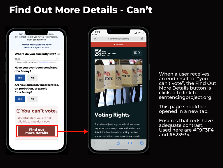
Taken from UX specifications created at completion of project. Each screen is detailed with actions and details necessary for development. Screen on right describes the action inclusion of actionable buttons.

Remote participants. Tested on 5 participants of the target group with in-test and a post-use questionnaire. Completed using the interactive prototype on Michigan, a more straightforward state, and Florida, a more complicated line of questioning.
Overall impression of completing tasks improved from average "Somewhat easy" to "Extremely easy". Completion times for tasks decreased fractionally. Introductory text was determined easy to understand, but also easy to glance over. Overall impression of the site improved from average "somewhat trustworthy" to "extremely trustworthy".
If you would like to read the full-length report document, please read below.