Desai Accelerator | Summer 2022
Role: UX/UI Designer
Team: Kirk Turrentine - Founder and Chief Technology Officer
Kate Shen - Graphic Designer
Sarah Whitman (me) - UX/UI Designer
Timeline: 2 weeks
Skills & Tools: Figma, High-Fidelity Prototype, Iterative Design Process, User Interface Design
seeme is an identity assurance and access management (IAM) platform that allows users to prove their identity in any transaction. It is currently the main platform being developed by Detroit Design and Technology for both B2B and B2C usage.

The seeme platform’s design lacked implementation of formal UX ideas. Many aspects of the existing design were not felt to be obvious design choices or clear from a user flow perspective. Additionally, many of the app’s features have now become outdated since the initial development of the app, thus leaving more room for confusion with users. Lastly, seeme has gone through a name change and has new branding, and the existing interface does not align with those changes.
The goal with this project was to redesign the mobile app interface for DDTec’s seeme platform, implementing new branding for a more seamless user experience. As a newer startup, DDTec wanted to have a clearer working prototype and screen mockups to use when presenting their ideas to potential investors, clients, and users.

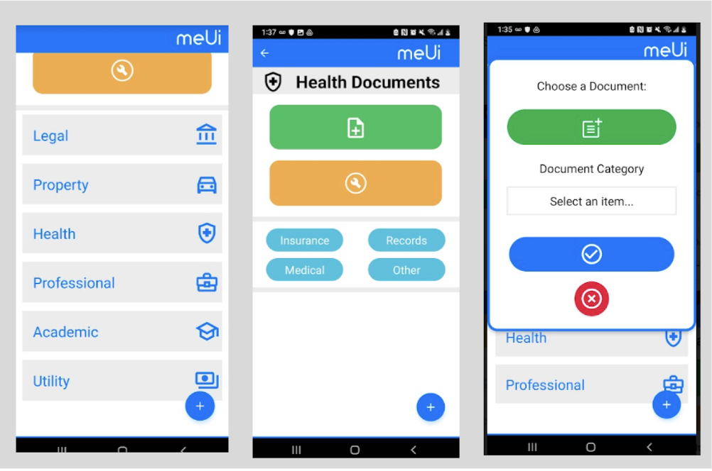
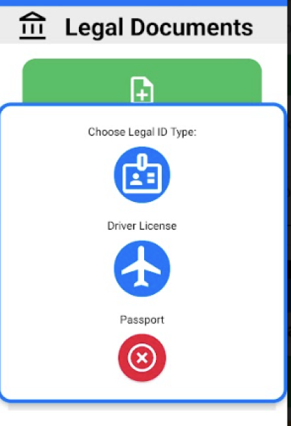
After meeting with our client to understand the issues with the current application interface, we studied the former design. There became a clear need for the branding guidelines to be implemented. For example, the above images show several different color schemes. Throughout this process, we began to understand which features and screens had now become obsolete.

We also pinpointed several key screens with interfaces that were confusing as designers, thinking about how it would cause confusion for users. For example, on the far left we see a list of document categories in an unspecified order. The second image shows a subcategory of health documents that does not entirely clarify still what type of document to upload. The farthest right image shows how proximity of text to image can cause unnecessary confusion over what an icon's use is.
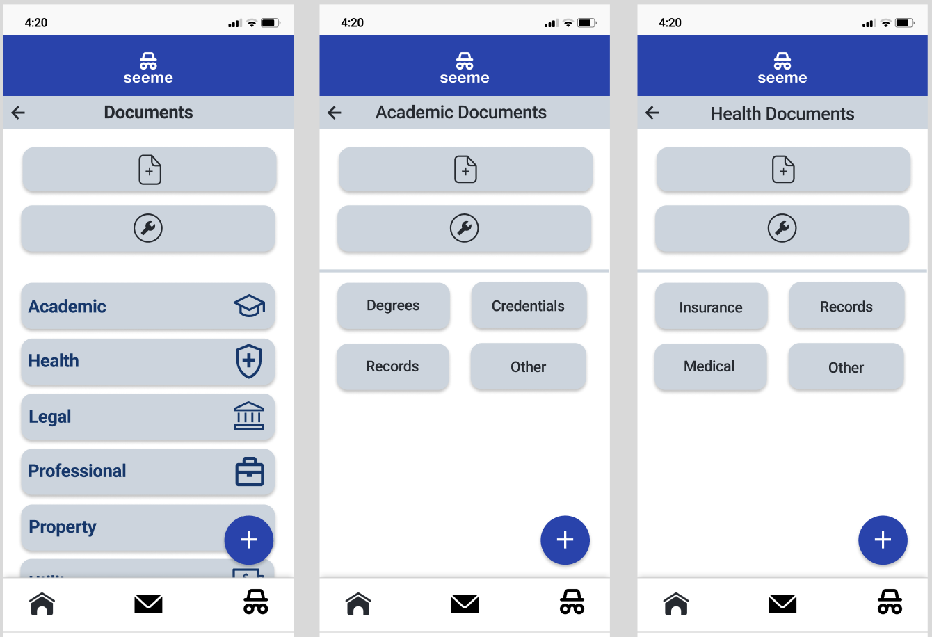
Something that we did next in our process was take the existing screens and mock them up as-is in the existing flow, but with the newly provided brand guidelines. We did this step as an experiment to see if perhaps aspects of the existing user flow did in fact make sense, when designed with a more consistent design structure. However, we found from this step that there were still categorical and flow issues, despite an improved UI experience.

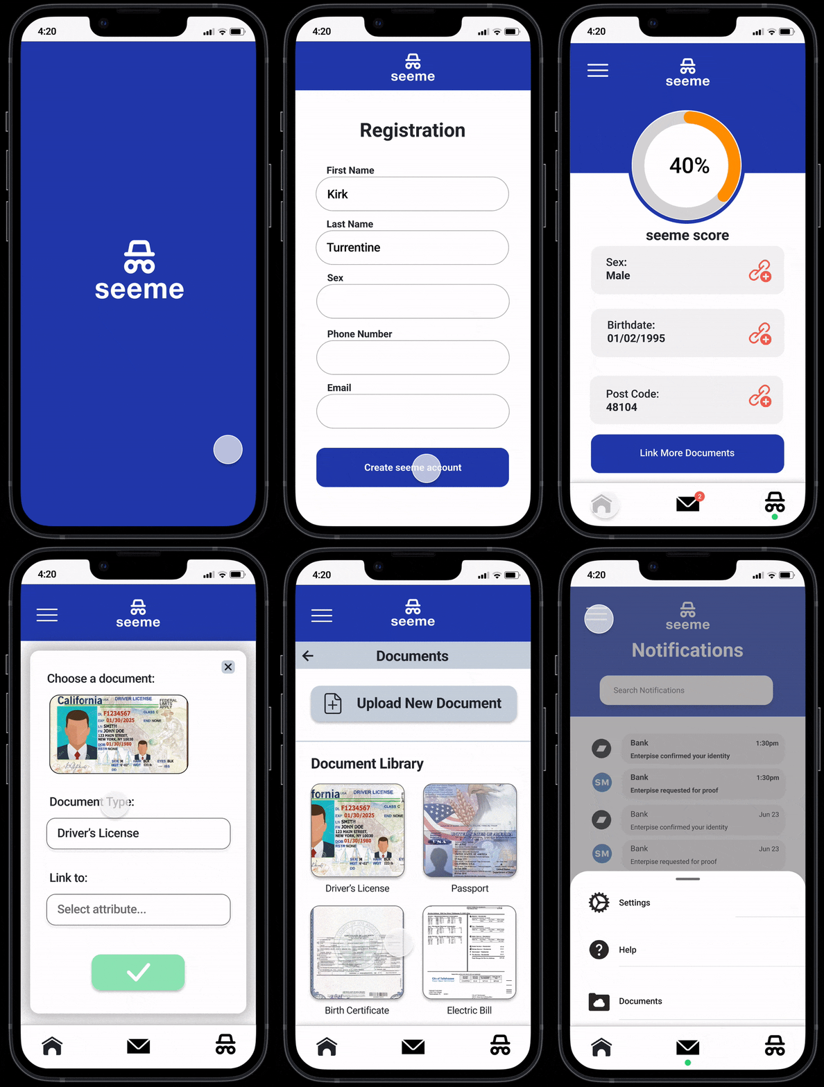
After our process to improve the UI, we consulted with our client, and developed a new proposed user flow and created a high fidelity prototype. As stated prior, we limited the color palette to be in coordination with the improved branding guidelines provided to us by DDTec.
To improve the overall experience of navigating the app, we implemented a more simplified categorization system for uploading documents. Instead of having a user navigate to a category - and potentially incorrectly guess which category a document falls under - we listed out the possible document types available for upload. This makes it clear upfront what a user can upload and takes the guesswork away from the user, making the process more streamlined.
We also built out the onboarding and profile sections of the interface to create the full experience a user would have navigating the seeme app.

DDTec is an early stage startup with a two founders and few users, so unfortunately we didn't have a large database of users to pull feedback from. However, in attempt to get more opinions outside of the design team, we incorporated continual feedback from our startup accelerator of 4 other technology startups, as well as other colleagues in the office.